projects
 |
|


 |
Recent
Nature-based Color Projects:
|
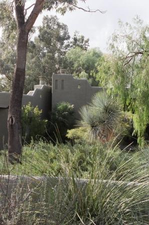
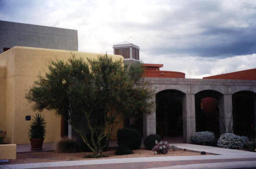
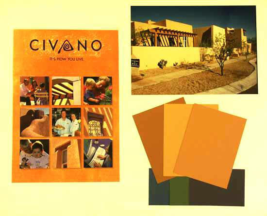
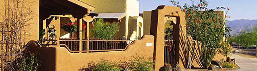
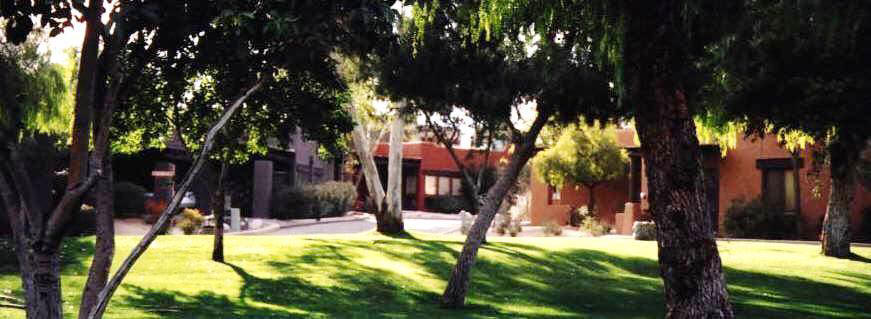
Community of Civano, Tucson,
AZ
–
exterior palettes for the Town Center and for RGC
Builders.
|
 |
|
   |
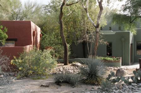
Canyon Ranch
Health Resort, Tucson, AZ
– exterior palettes for the 90
acre resort.
The Canyon Ranch palette is a mid-value range of chromatic
desert colors that come from the soil, the rocks, the bark of
trees, the greens of cactus and the reds of the desert flowers.
Harmony is maintained by using shades that are equal in tonal
strength. These earthy colors absorb the light without bleaching out, standing up to
the clear strong sunlight of the desert.
Read
more about Canyon Ranch's color design...
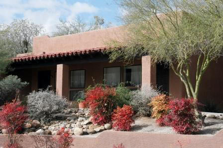
The SPA COMPLEX, at the physical and conceptual ‘heart’ of the
Ranch, is a bold red sienna, the color of the bark of the palm
trees outside.
|
|
%20Spa.jpg)
Canyon Ranch
Spa Exterior (Before) |
.jpg)
Canyon Ranch
Spa Exterior (After)
|
  |
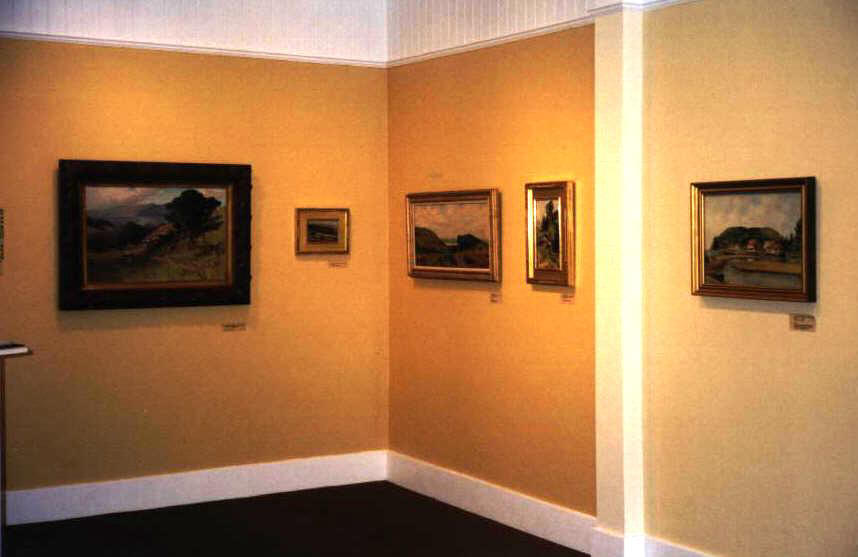
Bolinas Art Museum,
Bolinas, CA – palette for permanent collection gallery
The new gallery for the museum’s permanent collection is a room
with no windows, yet the paintings all speak of the beauty of
the light of the region. The three shades of golden yellow,
differentiating walls, alcoves and columns, bring the sun in.
Visitors comment that the art has never looked better!
|
 |
 |
|
 
|
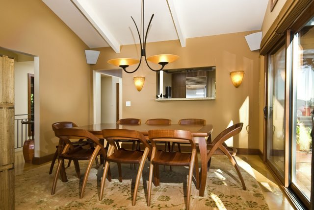
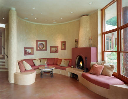
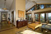
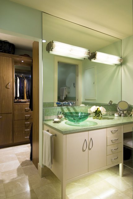
Kenwood California Residence –
Interior & Exterior palettes for a 2400 square foot home...
Read
Testimonial
|
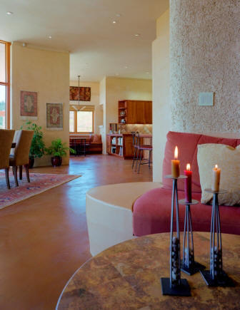 |
Working with
Mark and Karen was a ‘green’ designer’s dream come true! We met
when I was speaking at a green event and they shared their
vision of a home where they could live in harmony with Nature.
Three years later, their home is a reality.
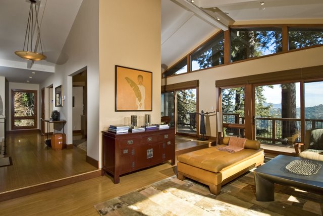
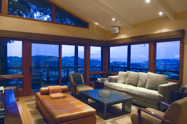
The organic
shape of the building, architecturally designed by Todd Jersey,
flows from the soft shape of the hills of the Sonoma valley,
with a purity and simplicity of both line and form. The
structural material, PISE, an earth wall construction, made by
utilizing one-sided formwork and high pressure air delivery,
gives the interior an interesting juxtaposition of smooth and
textured walls in the color of the soil of the place. Selection
of interior plaster wall colors was based on the restful, warm
monochromatic scheme that we carried throughout the home. In the
living room, niches were placed in the PISE wall to create
interest and balance and to hold the treasures that have special
meaning in Mark and Karen’s life together. Floors are
acid-etched concrete with rugs used sparingly to define
functional areas. Deeper tones and multiple textures give the
natural fabrics the richness and interest needed in a
monochromatic color scheme. Pattern was intentionally kept to a
minimum so as not to compete with the stunning views of hills
and gardens.
The respect
shown by Mark and Karen, both to the environment and to each
other, made this project pure pleasure!
|
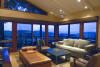
Jaeger's Residence
- My wonderful clients, Steve and Kristine, called me, requesting
a color consultation! That led
to a full service design job and a long-term relationship (we are
now doing their second house together). Their good taste and
appreciation of elegant furnishings led to some beautiful spaces.
The second house will be up on the website soon.

|
 |
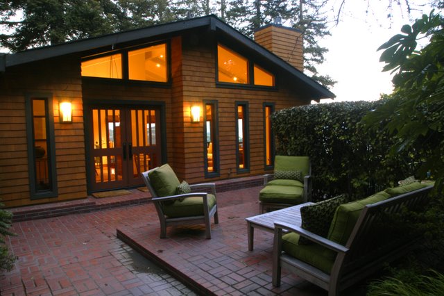
Applebury Project,
Bitterroot Valley, Southwestern
Montana: Second Home of an executive couple - –
exterior & Interior palettes for a
4,800 sq. foot residence.
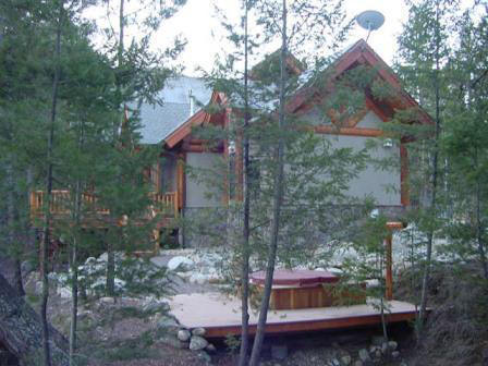
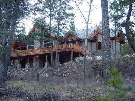
I walked
the bend in the river with my Montana clients when the house was
just a dream. The location was selected for the soothing sights
and sounds that a river provides. We all agreed that the
structure should be ‘naturally inspired’, that all the colors
and materials should support the beauty of the place. This view
from the river shows our success in gently connecting the house
with the site.
The house
builds on the region’s architectural legacy of log cabins.
During the design process, the materials selected shifted from a
traditional log package to a stone, wood and stucco combination
façade.
We
started our interior design conversation by talking about how
the house should feel. Out of that discussion came
decisions about how the house should look. The ambiance desired
was one of warm welcoming, both to business weary executives in
search of a retreat and to the many friends that would come to
visit, hike and fish the world-class river. We started with the
mellow warm browns of wood floors and the soft natural colors of
stone. Then we added oriental rugs, rich colors, comfortable
textured fabrics and furniture, and one-of-a-kind lamps and
accessories. The couples’ collection of western art added the
final touch. The result? Casual elegance, my favorite design
style.
(To
maintain the privacy of the owners, interior photos are
available only upon request).
Read
Testimonial
|
 |
|